The theming in Tomorrowland has always been an issue since its opening, but that is now slowly changing as Disney is introducing a new style to Tomorrowland in the Magic Kingdom.
We just saw the installation of the new Tomorrowland entrance sign, and the theming throughout the land is being transformed into that clean, white design to match. Let’s take a look at what’s going on.
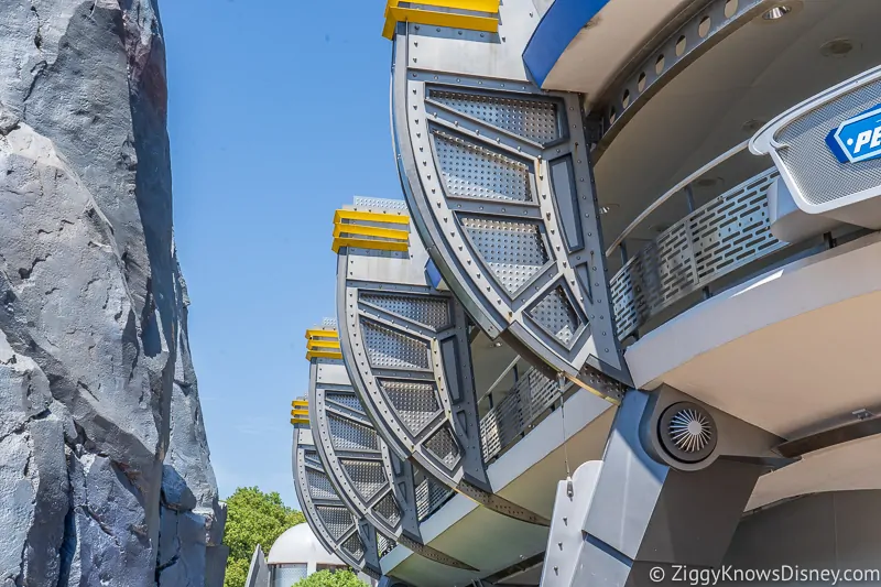
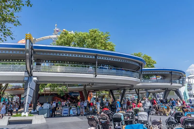
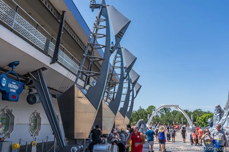
From walking through Tomorrowland you’re obviously familiar with the panels installed up along the PeopleMover track on the main walkway. They are big and bulky and made in the more steampunk style which has been the standard in Tomorrowland for some years now.
Here is an example of the panels I’m talking about:
Looking around Tomorrowland we found that these panels are starting to get stripped down and changed. Here you can see one of the panels which has the outside of the panel removed and is left only with the metal base:
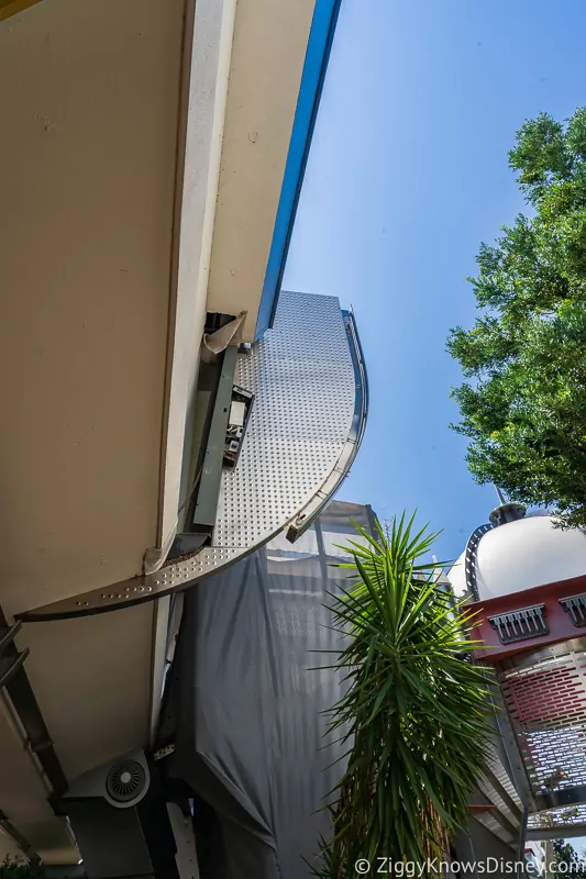
Behind the tarp is another panel which is getting stripped down too. It seems like this change is starting over on one side of Tomorrowland and working its way throughout the land:
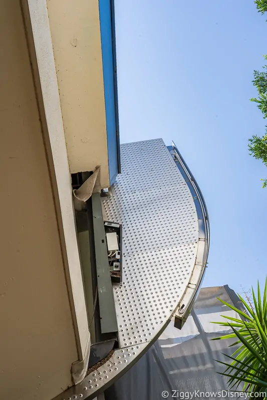
Again, here are some pictures of the panels in their current state so you can see the difference and as the work progresses, these ones will get changed out too:
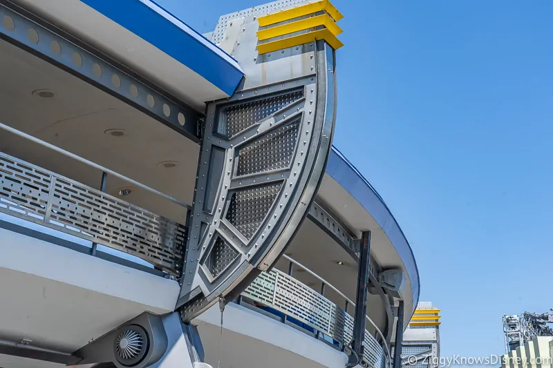
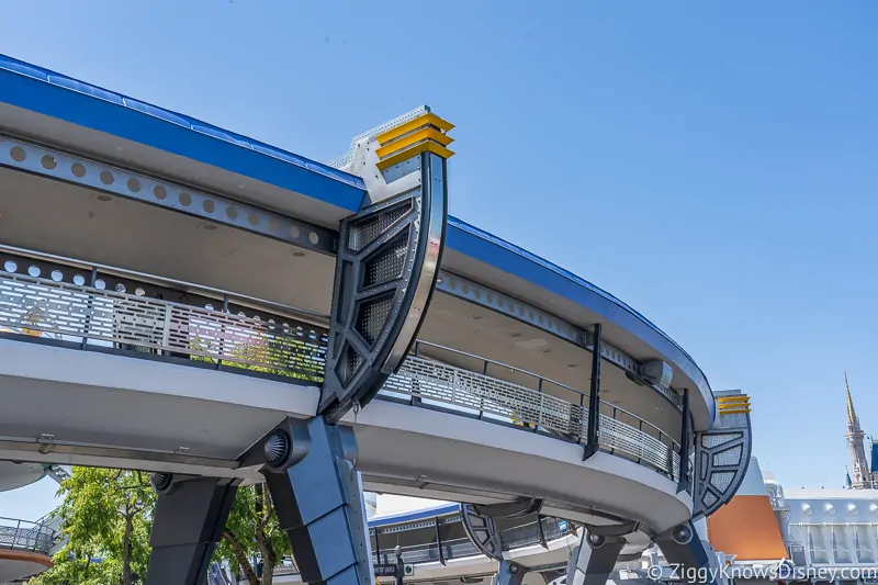
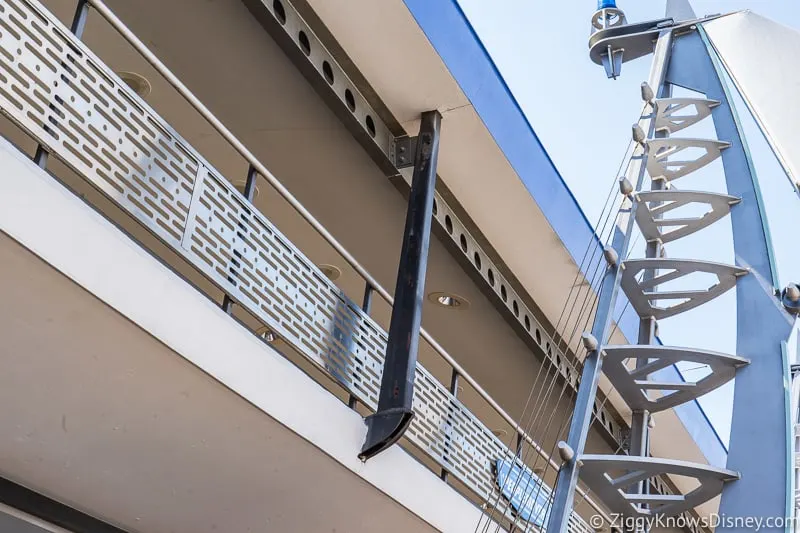
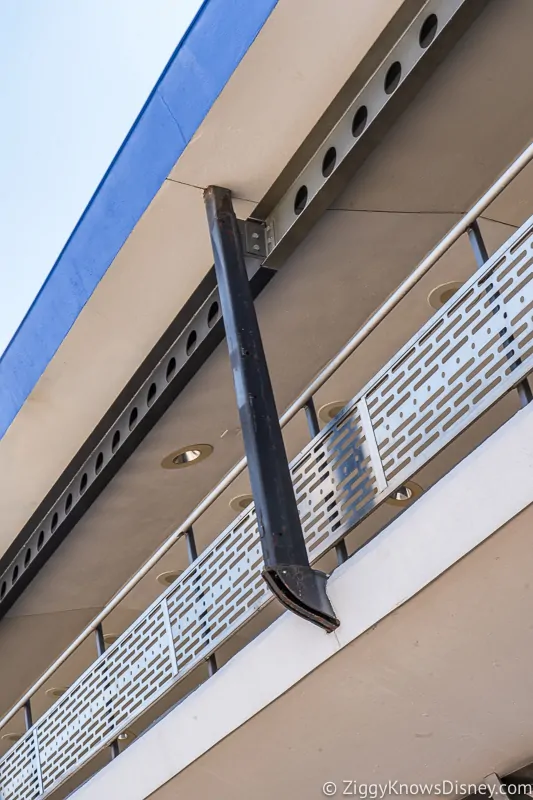
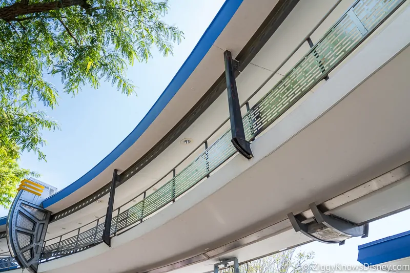
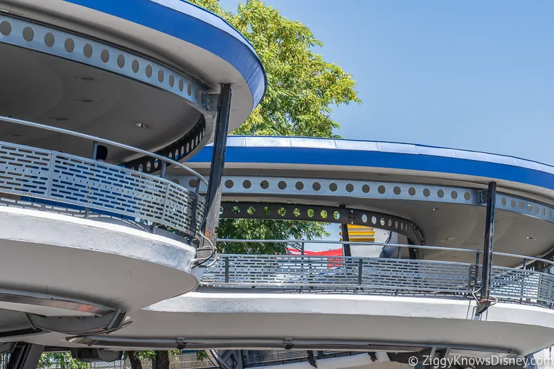
Now besides those big panels, the smaller supports running along the PeopleMover are also getting a design change:
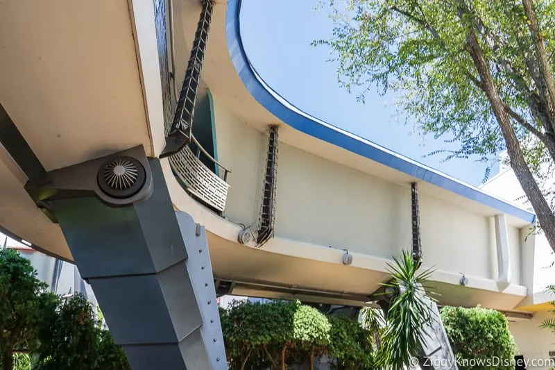
These have been stripped apart and are getting prepared to be plastered over with a simple white style:
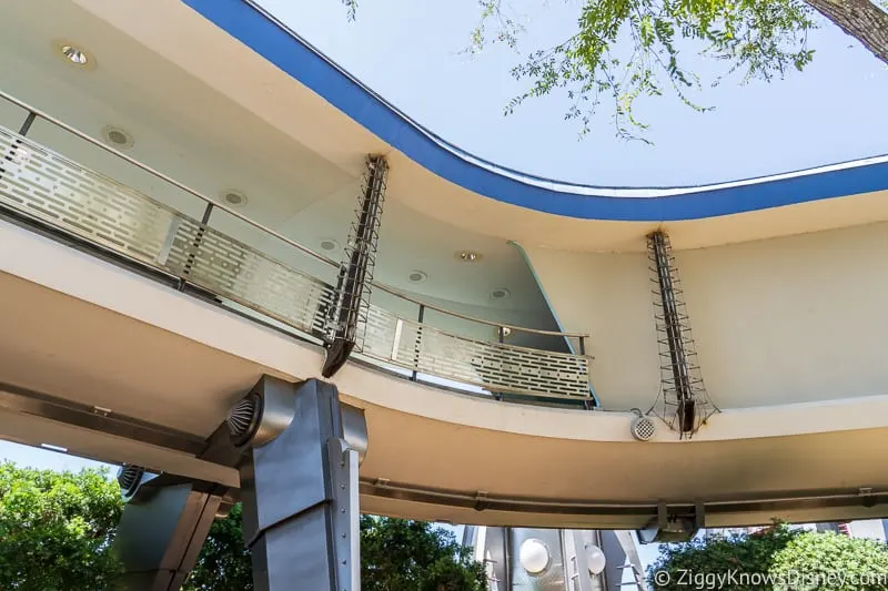
Look at the one on the left which has been stripped and the new one on the right that it will change into:
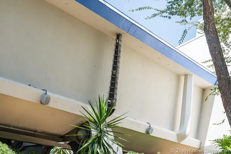
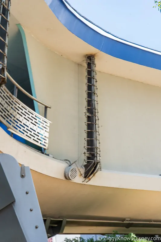
If these look familiar, it’s because this is already the design over in the part of Tomorrowland near Space Mountain:
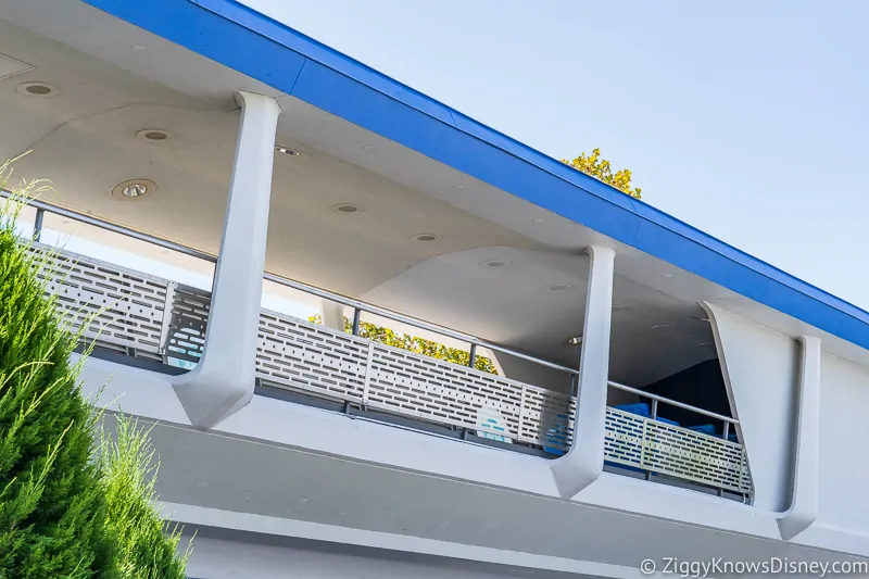
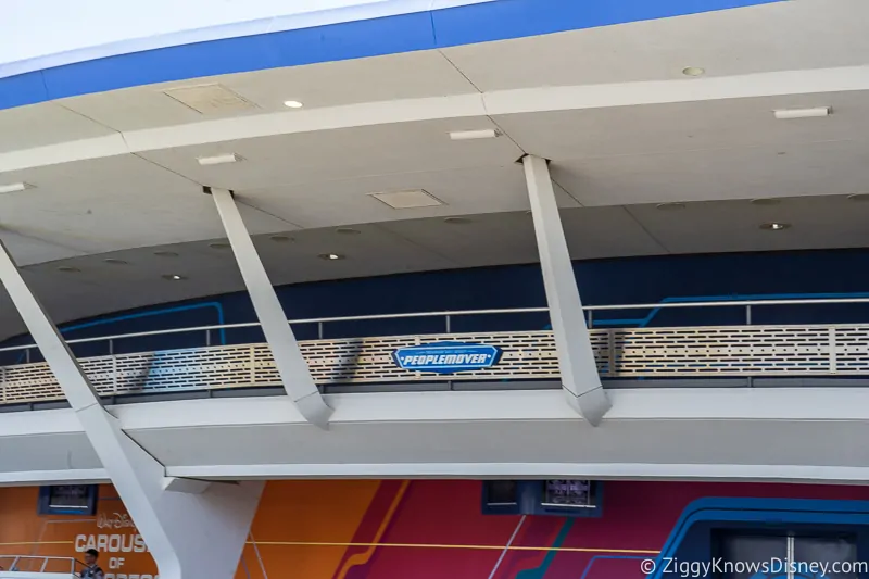
So they are getting rid of all the steampunk design and moving over to the simple, white design:
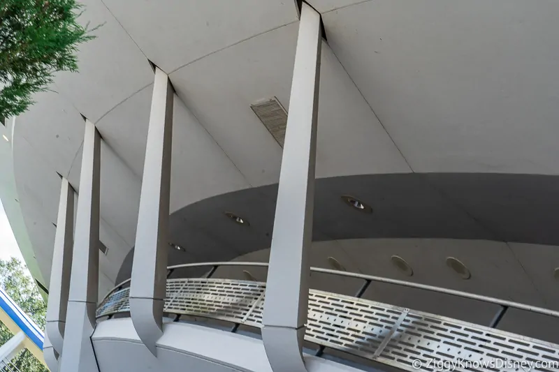
These smaller panels have been stripped down throughout Tomorrowland, though they aren’t quite ready to be built yet:
Just to show you the difference, again, look at how they used to be with the bulky metal panels that were there before:
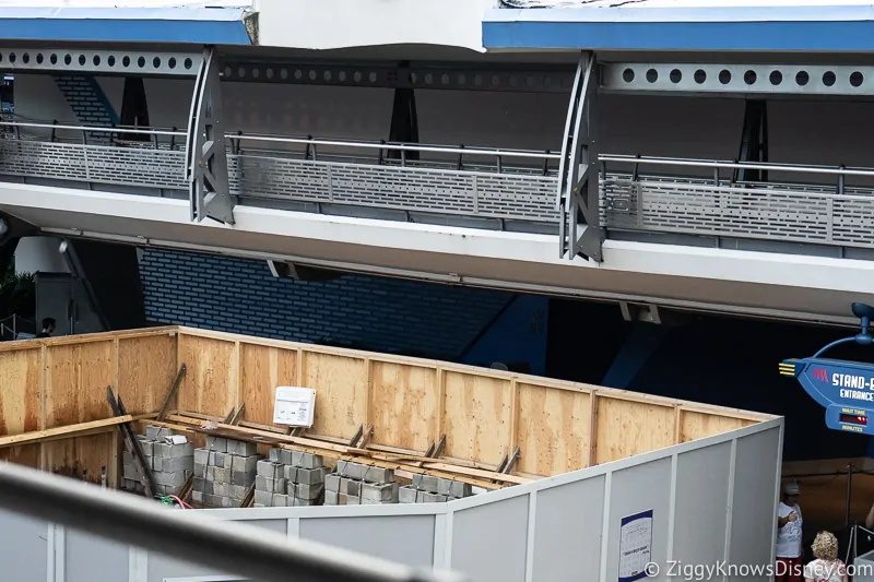
Now back to a current shot, they are no more:
Again, this is what they will look like when done:
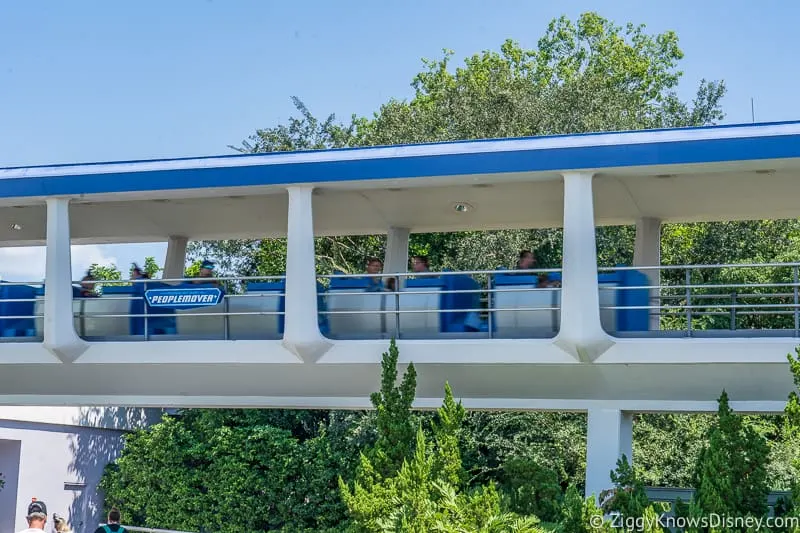
I’m sure these panels aren’t long for this world either:
We can see the new sleek, white look in some of the signage in Tomorrowland like the Joffrey’s sign and the one for Monster’s Inc:
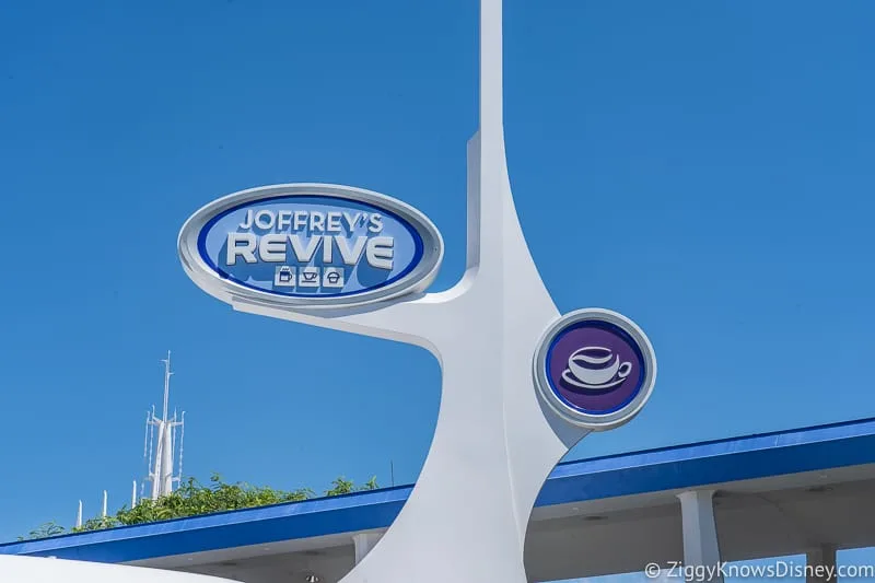
Besides the new entrance and the style changes, Tomorrowland is also getting a new E-Ticket attraction in 2021, the Tron Lightcycle Run Roller Coaster. Disney knows that people are going to be spending a lot of time in Tomorrowland once that opens and are trying to clean everything up for the 50th anniversary.
There’s no word on when all these changes will be done, though it will most likely be happening slowly over the next few months.
We’ll continue to update you as the theming continues to change in Tomorrowland so stick here at Ziggy Knows Disney for all the latest updates!
Your Thoughts:
I want to know what you think about the changes to Tomorrowland…
- Do you like the new style or the old one?
- What other changes would you like to see in Tomorrowland?
Let us know in the comments section below!
If you enjoyed this article, as always I appreciate it if you’d share it with others via social media. I work hard at making this website into a useful resource for you and your family to plan your visit to the Disney Parks and I hope it can help you! Thanks 🙂

My name is Ziggy and I love Disney, everything Disney! I grew up on Disney and it has and continues to be a huge part of my life. I started young when my parents took me to Disney World when I was 18 months old. Little did they know that would be the first of an uncountable number of trips we would take. I have so many amazing memories going to Disney with my family and friends and it has been interwoven into my DNA.
TITA
Sunday 12th of April 2020
Thank you very much for the information!
Charles Littman
Thursday 26th of December 2019
This is a retro style much like things looked like when Tomorrowland last got a major overhaul It was 1975 when Space mountain opened. Just Yesterday!